My former company’s retirement plan is conducting their annual enrollment period for healthcare insurance this month. The retirees, their spouses and dependents may select one of several plans during the open enrollment period.
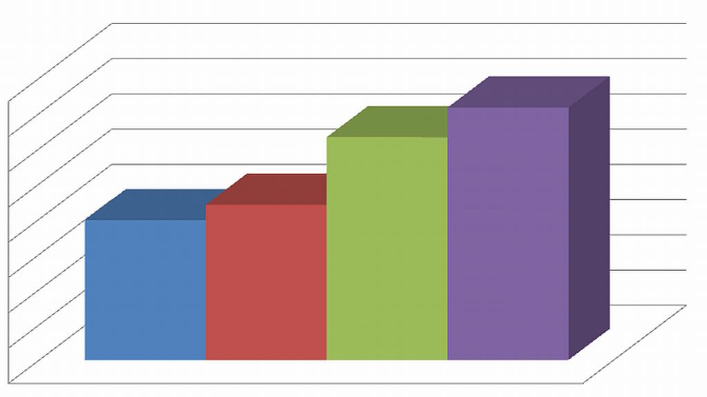
I went on the website to make our selections for the coming year and, much to my annoyance, the premiums are going up yet again. I decided to look at the recent history of the rates and came up with the chart above. The image has neither legends nor scales, but I am going to explain them.
The four vertical cubes represent 2015 through 2018 and the height of each shows the relative amount for the premiums. I limited it to these four years since that is the period when the Obummercare mess has screwed up the system for everyone, not just ACA exchange subscribers.
The chart applies only to Damsel’s insurance premiums that we pay monthly. I did not do the complex analysis of my Medicare and Medigap (for the 20% that the .gov doesn’t pay) which I may do one of these times. Below are the results according to the chart above:
- Increase from 2015 to 2016 – 10%
- Increase from 2016 to 2017 – 30%
- Increase from 2017 to 2018 – 12%
That’s a whopping total of 52% increase over a period during which we realized NO additional cost of living compensation. We are on virtually a fixed income. The last Social Security cost of living increase was exactly canceled out by an increase in my Medicare part B premiums.
This is yet another example of how the Government screws us up by trying to “help” us.


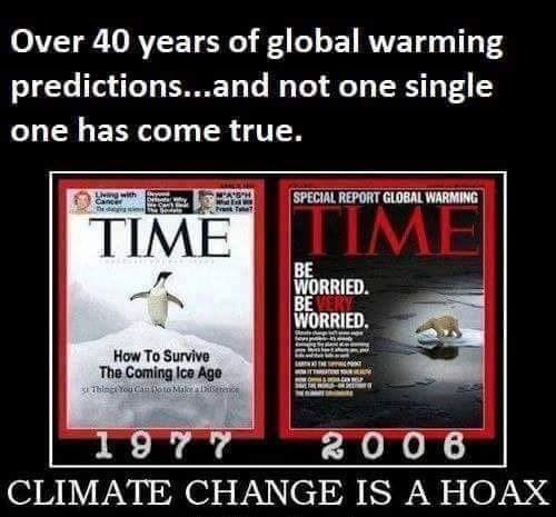
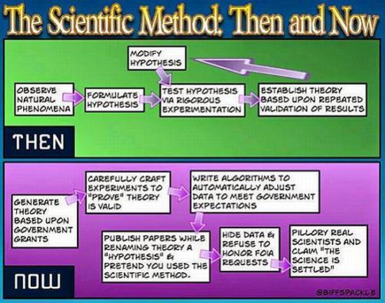
 In an effort to refute findings of the Intergovernmental Panel on Climate Change (IPCC) that backed off of the anthropogenic climate change claims, sources now tell us that our own National Oceanic and Atmospheric Administration (NOAA) flat-out lied about earlier findings in a report. A retired NOAA scientist recently came out to expose that the NOAA report was “doctored” to give the impression that the earlier IPCC findings were in error and should be disregarded.

 Increased CO2 in the atmosphere has never been proven to cause anything other than enhanced benefits for life, both flora and fauna. The drumbeat from the warmists is steady and their support from the media makes the feeble-minded proletariat all the more convinced that glaciers will melt and coastal cities will be destroyed. You know, the sky is falling, the end is near, etc.