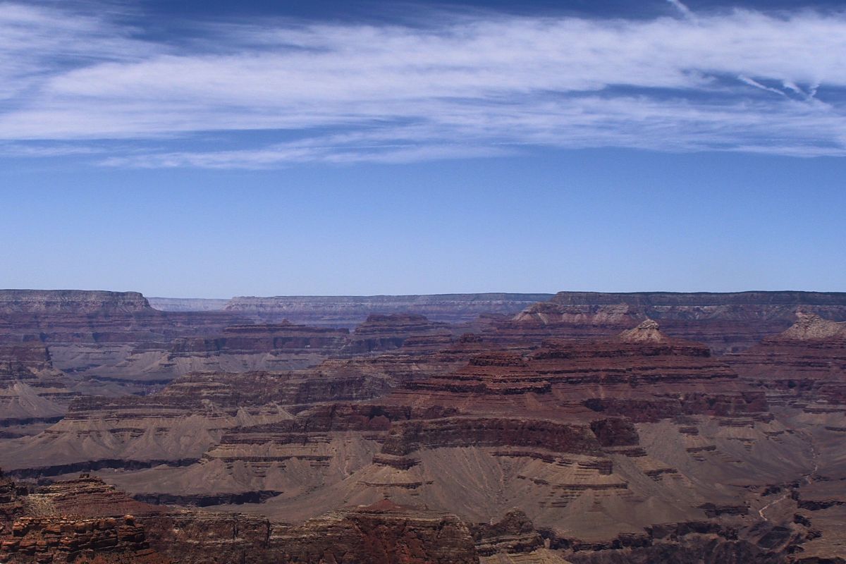
Grand Canyon
Throughout the entire National Park there have been an average of two to three visitors falling into the canyon each year (excluding suicide attempts). With the annual number of visitors to the park exceeding five million annually, this is not surprising given the idiocy of some people stepping across barriers to get selfies at the canyon edge. Add that to the carelessness of folks stepping on areas of slippery or crumbling surfaces and those who feign falling in and actually do. Still, the casual visitors observing the parks recommendations about safety have little to worry about.
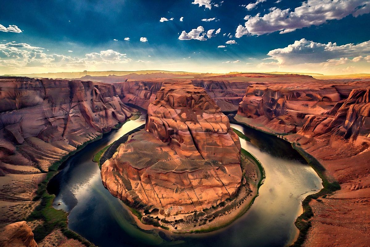
Horseshoe Bend
Before the recent addition of additional safety rails and observing platforms, the number of falls into the 1000 foot deep canyon at the bend were on the order of less than one fatality per year. Now, the numbers have dropped such that between 2010 and 2022 there have been only four fatal falls and those due to not observing the safety rails and rules. Horseshoe Bend gets far fewer visitors than Grand Canyon although that number has risen to about two million visitors per year.
The conclusion here is that no persons observing the rules and safety rails/barriers should have any worries about falling in. Those sane folks will no doubt observe other, less sane folks, doing exactly what gets them into harms way.
Damsel and I haven’t been to either of the locations above recently, but may do so in the coming months or years, depending on circumstances. Our lives have become a bit more complicated recently, but more on that later.
Images: top courtesy of USNPS Yavapai Point Webcam and bottom from SuperGrok AI