
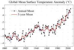
 In a previous article, I established that the average global temperature has generally risen over the past century. The graphic to the right (courtesy NOAA) clearly shows this temperature increase. There is little doubt that the planet is warming and that global temperature trends over the past 400 years have been directly proportional to observed solar activity. Sunspot counts are high when temperatures increase, and
low when temperatures decrease.
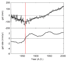 The graphic to the left (Courtesy CO2 Science) shows sea level and rate of sea level change over the past 200 years or so. A quick observation shows sea levels decreased from 1800 to 1860 at which time a minimum level reversed. Note also that the rate of sea level change (the bottom line on the graph) turned toward a higher rate of change just prior to that time. Note also that the rate of change went from negative to positive at the same time the minimum sea level occurred. You can also see that sea levels have steadily increased during the portion of the graph where the rate of change is positive. Finally, note that the rate of change peaked out around 1950 and dropped into a trough and then another peak, lower than the 1950 peak, around 1998 or so.
What’s the point? Well, if global warming is melting the ice caps and glaciers, one might expect that the rate of sea level change would also be increasing — but that’s not true according to the graph above. Since 1950 or so, global temperatures increased but the rate of sea level rise has not increased. Moreover there is considerable evidence that Antartic ice sheets are becoming thicker.
The matter of sea level change is discussed by the editors at CO2 Science who conclude the editorial with the following insightful remarks:
Clearly, either something is drastically wrong with climate-alarmist theory, or something is drastically wrong with the pertinent real-world data. Although many people choose to believe the theory over the data – or they promote the theory in spite of believing the data (or they simply ignore the data) for philosophical or political reasons – we find it much more compelling – and satisfying – to both believe the data and act in harmony with that belief.
So we ask you what we ask ourselves almost every day: what do you believe? … why do you believe it? … and how do you act in light of that belief?
Finally, quoting the famous author Michael Crichton . . .
“Historically, the claim of consensus has been the first refuge of scoundrels; it is a way to avoid debate by claiming that the matter is already settled. Whenever you hear the consensus of scientists agrees on something or other, reach for your wallet, because you’re being had.”