
 We’re adding a new item to our Global Warming Resources page. The National Center for Policy Analysis has compiled a Global Warming Primer in PDF format that illustrates in graphical form some of the concepts of Global Warming that are often misunderstood or not understood at all by many people with opinions about climate change.
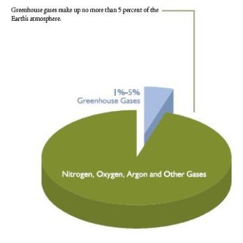
At the right is a pie chart illustrating that greenhouse gasses are less than 5 percent of the atmosphere. A subsequent pie chart shows that 95 percent of that small wedge is harmless water vapor!
The primer is an easy read since most of the pages are graphs and pie charts with annotations to clearly explain to the reader what concepts are being presented. The primer is based on a review of available scientific research. The NCPA received no money and no input from any private company or government agency.
The primer is a welcome change from the myriad of complex and often daunting data on the subject. All that engineering and scientific stuff is fine for some of us, but try and explain it to your kids and others without the background and you get blank stares.
Hat tip to Planet Gore – A Global Warming Primer: A Graph is worth 1,000 words.