
 In an effort to refute findings of the Intergovernmental Panel on Climate Change (IPCC) that backed off of the anthropogenic climate change claims, sources now tell us that our own National Oceanic and Atmospheric Administration (NOAA) flat-out lied about earlier findings in a report. A retired NOAA scientist recently came out to expose that the NOAA report was “doctored” to give the impression that the earlier IPCC findings were in error and should be disregarded.
Now that the Trump administration is in charge, Texas Congressman Lamar Smith justifiably has launched an investigation into the false report. Without the previous administration and it’s biased #fakenews climate change agenda, perhaps Congressman Smith’s effort can gain some traction.
From Thomas Gallatin writing for The Patriot Post:
In 2013, the Intergovernmental Panel on Climate Change acknowledged what some in the climate science community had begun calling a “hiatus” in global warming — that “the rate of warming over the past 15 years … is smaller than the rate calculated since 1951.” This acknowledgement by the IPCC threatened to derail the alarmist narrative of human activity being the primary cause of global warming espoused by many on the Left. And indeed it was, as skeptics of anthropogenic global warming used the IPCC’s admission as further evidence to support their questioning of the politically correct narrative.
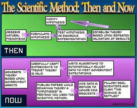
Fast forward two years to the National Oceanic and Atmospheric Administration’s (NOAA) release of a report, known as the “Karl study,” which stated flatly, “There is no discernable (statistical or otherwise) decrease in the rate of warming between the second half of the 20th century and the first 15 years of the 21st century.” The report further asserted that IPCC’s conclusion about a “climate warming hiatus” was “no longer valid.” This report conveniently supported Barack Obama’s climate alarmist agenda and his dubious claims of the science being “settled,” even though at the time there were several government scientists who raised objections over the reliability of the report, claiming the data was cooked.
This prompted Rep. Lamar Smith (R-TX) chairman of the House Science, Space and Technology Committee to launch an inquiry into the claims of manipulation of climate data and records by officials at NOAA. However, much of the committee’s efforts were frustrated over Obama’s last year in office due to NOAA officials’ refusal to comply with records requests even upon the issuance of subpoenas.
Over the weekend, a recently retired top scientist from NOAA, Dr. John Bates, alleged that the Karl study report applied questionable data in order “to discredit the notion of a global warming hiatus and rush[ed] to time the publication of the paper to influence national and international deliberations on climate policy.” Rep. Smith responded to the latest revelation by saying that it “justified” the committee’s investigation into the matter. He added that, under the Trump administration, he trusts they will be able to get to the bottom of the matter.
[More]

 Increased CO2 in the atmosphere has never been proven to cause anything other than enhanced benefits for life, both flora and fauna. The drumbeat from the warmists is steady and their support from the media makes the feeble-minded proletariat all the more convinced that glaciers will melt and coastal cities will be destroyed. You know, the sky is falling, the end is near, etc.