
When the International Conference on Climate Change met last month in New York, the purpose was not that of politicizing climate change, but rather to present the actual and relevant science on the topic. John Hinderaker at Power Line wrote about the ICCC event in his post today. “Dispelling the Global Warming Myth.”
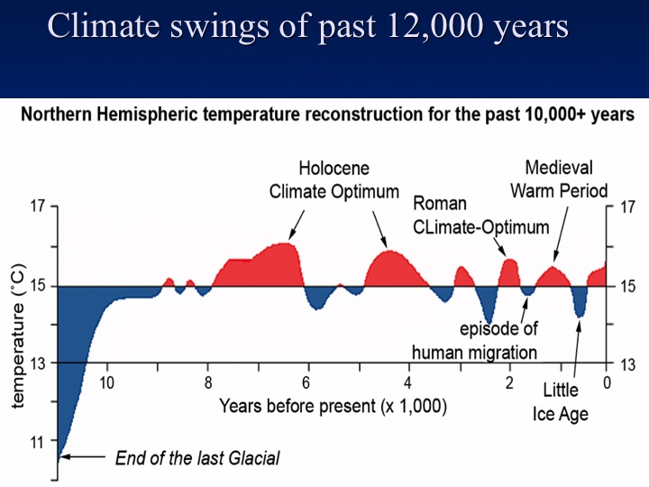
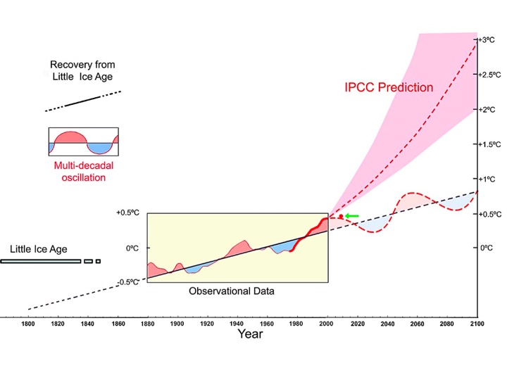
I found these two graphics to be highly informative – both serve to show the normal oscillatory behavior of the climate cycle. The second chart demonstrates how divergent the UN’s Intergovernmental Panel on Climate Change (IPCC) data is from reasonable scientific expectations.
The first chart shows the actual temperature oscillations since the last great ice age, which was just about over some 12,000 years ago:
The second chart shows the oscillations after recovering from the little ice age with observed data for the last 130 years and projections in both directions on the time axis. Note the little green arrow which is pointing to a red dot where we are today – significantly below the so-called trend predicted by IPCC’s alarmists.
Ah, Baffle them with facts and science.
It’s highly overrated and it goes against the consensus, or the disbelief in the religion!
Haven’t you heard of The Goracle prophesy?
Thou Shalt Not Dispute or put false gods before the gore.
The only thing we have to trust is fear itself….. or something.
/snark snicker chuckle full burst out laughing.
ps; got a new home guys… hope you all are doing well! 🙂
Hey Kini – we’re doing great. I saw your new internet digs and made the change to the blogroll a few days ago. Looking good.
As for the Greenbats:
They drink a special sort of kool-aid, don’t they?
Chart shows some good points, I’ve been familiar with them for some time. Use to teach geology. I think the issue of global warming or global cooling is actually not important—the issue is could we do anything to prevent either. I fail to see how anything man can do can change the outcome one way or the other. Its actually a silly argument. Both sides have their own agenda. I tend to come down on the cooling side, but could be wrong.
Ron,
If you’re interested in more on this topic, visit the Global Warming Reference Page. I especially like the Correlating Sunspots to Global Climate page.
They gotta do something with these charts. The first one looks like my mattress before we so our semi-annual flip. The second one looks like a sneeze pattern. And what’s with all the pink n’ lavender??
Come on, cowboy up with your presentations!
If I’m going to die I want primary colors!
How’s this?
The original was from an Asian scientist. I guess they like delicate colors over there. Y’know – lotus blossoms and chrysanthemums.