
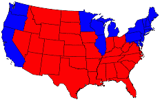
 This is a map of the country from the 2004 presidential election where states carried by Bush are colored red and blue if carried by Kerry. The map of “red states” seems to dominate the country, since they cover far more area than the blue ones. However, this is a little misleading because it fails to take into account the fact that most of the red states have small populations and most of the blue states have large ones. The blue may be small in area, but they are large in terms of numbers of people, which is what matters in an election where the majority wins.
However, the Federalists designed the Electoral College to mitigate domination by states with great population over those without. Constitutional scholars know that this is an important concept the Founders handed down.
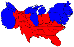 Now, if we were to re-map the country using a cartography technique to distort state boundaries to account for the population of that state, we get a much different picture. Each state now has a hypothetical area in proportion to its population. Regardless of this distorted view, however, the Electoral college selected President Bush for his second term. The actual nationwide popular vote also went to Bush by a plurality of over six million votes.
An interesting observation of the distorted map is that many of the blue states appear bloated and overweight. In real life, it seems, the governments of the ‘bloated’ states are as bloated and overweight as the hypothetical boundaries.
Sadly, California, the most bloated of the re-mapped states, is one where government overtaxes, over-regulates and repeatedly invests public funds in failed government programs, the educational system being the most paramount among them.
Maps prepared by Michael Gastner, Cosma Shalizi, and Mark Newman of the University of Michigan.
I live in NY an obviously blue state, so all I can say is thank the Founding Fathers for the Electoral College.
Yep, New York looks pretty fat. And Jersey, for its size, is the li’l fat boy on that coast for sure.
The founders had remarkable insight. The basic Bill of Rights is testimony to that.
Thanks for your thoughts, Glenn.