Skip to content

Cap'n Bob & the Damsel

Perspectives on Life and Politics

Cap'n Bob & the Damsel

Complimentary Colors

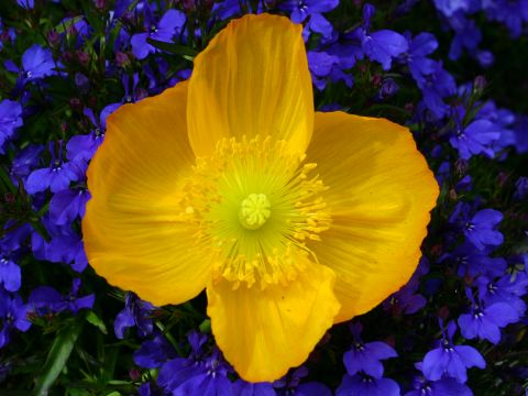
This yellow Icelandic Poppy is nicely silhouetted by the little blue flowers in the ground cover underneath. Very pretty.

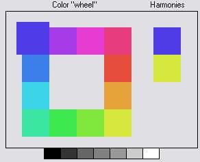
Why do these colors go so nicely together? Looking at a color scheme design tool we use, it shows that indigo-blue and and pale yellow are truly complimentary, as can be seen in the color wheel diagram below.

Share
15 Apr 2006 by Damsel California Home & Garden Photography
  • Next The Right Quadrant
  • Previous Vandenberg Minotaur Lights

Featured Pages

  • About This Weblog
    • About Cap’n Bob
    • About Damsel
  • Special Features
    • The Great Climate Hoax
    • Upgrading from Blogspot
    • Solar Ephemeris

Access

  • Log in
  • Entries feed
  • Comments feed
  • WordPress.org

Search

Categories

Archives

Blogroll

  • Ace of Spades
  • Collecting My Thoughts
  • Hot Air
  • IMAO
  • Instapundit
  • Jihad Watch
  • Kini Aloha Guy
  • Patterico
  • Power Line
  • Professor Bainbridge
  • RedState
  • Right Wing News
  • Stilton’s Place
  • Tammy Bruce
  • Wizbang

Climate Science

  • CO2 Science
  • Greenie Watch
  • Watts Up With That?

News and Entertainment

  • Daily Breeze Front Page
  • Daily News-Sun
  • Day By Day Cartoon
  • The Patriot Post
  • The Wickenburg Sun
  • ZooBorns

Pro-Second Amendment

  • Ballseye’s Boomers
  • Clayton Cramer
  • Every Blade of Grass
  • Gun Blog Black List
  • Guns and Money
  • John Lott
  • Lagniappe’s Lair
  • Nobody Asked Me
  • Not Clauswitz
  • The Truth About Guns
  • The War on Guns
  • View from N. Central Idaho
  • View From the Porch
  • VolkStudio Blog

The Other Blog

  • Verna and Bob's Weblog

Cap'n Bob & the Damsel © 2026. All Rights Reserved.

Powered by WordPress. Theme by Alx.